East Coast Beach House “After” Photos

Interior Design Service Online

Interior Design Service Online

Interior Design Service Online

Interior Design Service Online

Interior Design Service Online

Interior Design Service Online

Interior Design Service Online

Interior Design Service Online

Interior Design Service Online

Interior Design Service Online

As a virtual interior designer, receiving “after” photos from a client is always a treat! Here are some recent photos of an east coast beach home I was lucky enough to design. This lovely house was a new construction project designed to be causal, calm and coastal – everything beach without the literal beach references.

More project photos to follow. Please check my blog https://www.interiordesignserviceonline.com/blog/ often for other design inspiration.

Top Five Purple Picks for Interior Decor

Purple has never, ever been my color. I often wonder if this is a designer thing as I distinctly recall a designer I worked under in San Francisco’s hating purple. I mistakenly wore a lavender Brooks Brother’s blouse one day to the office and was reprimanded by her assistant “didn’t I know purple was off limits?”

Fast forward 10 (okay 15 years) later and many years working as an interior decorator online and I admit the color is slightly growing on me. The strongest influence is my 6-year-old daughter who has decided she is “over princess prissy pink” and only likes purple. Way too much watching of Descendants perhaps!

So in honor of her new favorite color, and a color that is growing on me, I have complied a list of five top shades of purple for interior design:

Interior Decorator Online


Benjamin Moore

Purple Rain

1386

Thank you Prince for a fabulous song and Benjamin Moore for this deep, intense color!


Glidden Quaint Purple Rose HDGV62


Glidden

Quaint Purple Rose

HDGV62

Not too girly yet still soft and feminine.

Behr Glitterati P120-7


Behr

Glitterati

P120-7

Super glamour and rich!

SW Mauve Finery 6282


Sherwin Williams

Mauve Finery

SW 6282

Sophisticated enough for a Master Bedroom when paired with black furniture, white bedding and mercury glass lamps.

BM Lavender Lipstick 2072-50


Benjamin Moore

Lavender Lipstick

2072-50

Color is 6-year-old girl and interior designer mom approved!

Hale Navy by Benjamin Moore Online Interior Decorator Color of the Week

Online Interior Decorator

https://www.pinterest.com/pin/143059725640303780/

First and foremost, I completely admit that I am on a deep blue kick. Very rarely does an “in” color speak to me in this way but there is something about navy blue that is classic and so lovely.

This week I spent a morning with a client selecting a deep blue wall color for her Dining Room. Hale Navy by Benjamin Moore was the absolute winner. What I love so much about this color is that it is a neutral in an unexpected way. A deep blue color, yes, but more of a backdrop than an in your face color. Almost like a pair of great jeans – they go with anything.

The below photos show just how great this color is with so many different styles.

Online Interior Decorator

http://oohm.com.au/wp-content/uploads/2016/01/cb2-roadhouse-leather-bar-stools-palecek-green-oaks-pendant.jpg


Online Interior Decorator

http://wastingtimewisely.com/wp-content/uploads/2014/07/IMG_0162_REV.jpg


Online Interior Decorator

http://myoldcountryhouse.com/batik-af-610-hale-navy-hc-154-snowfall-white-oc-118-975×1024/

For some of my other favorite paint colors, please follow my Pinterest Board “Favorite Paint Colors”.

Benjamin Moore Van Deusen Blue Online Interior Decorator Color of the Week

Online Interior Decorator

HGTV Magazine

If you are looking for a change and are ready for dramatic, consider painting a room in a gorgeous navy blue color. Whether used in a bedroom or a study or even your front door, a rich, dark navy color will transform your home.

One of my all-time favorite navy blue paint colors is Van Deusen Blue by Benjamin Moore. Complex, sophisticated and classic.

For some of my other favorite paint colors, please follow my Pinterest Board “Favorite Paint Colors”.

Best White Paint Colors

online interior design services

Lately I have had a number of questions about picking out the right white paint. As an online interior decorator, the most asked question is what is your favorite white?  When selecting the perfect white paint and you have hundreds of choices to choose from; making a decision can be overwhelming. Warm whites, cool whites, ultra-whites, creamy whites – it can be hard to see and know the difference when they all look white.

So I have collected my favorite colors from popular paint brands to hopefully help you narrow down your options.

Here are my all-time top five go to white paint colors – in no particular order:

BM Linen White 912

Benjamin Moore / Linen White 912 – Linen White is a warm white with a yellow undertone. I love to use Linen White on walls when you want the clean look of white but still some warmth.


SW Alabaster 7008

Sherwin Williams / Alabaster SW 7008 – Whether you are painting trim, wainscoting, walls, or cabinets Alabaster is a great option. Alabaster is a crisp yet creamy white with no yellow or antique undertones.


BM White Dove OC-17

Benjamin Moore White / Dove OC-17 – White Dove is one of the most universal white paint colors ever. It almost always looks great. It is a white with a touch of cream and a touch of gray without being dingy.

BM Navajo White OC-95

Benjamin Moore / Navajo White PM-29 – Not to be confused with Sherwin Williams Navajo White (the colors are completely different), Navajo White by Benjamin Moore is warm and rich. This reads almost like a beige-yellow. If you have a lot of natural light and you’re going for a Mediterranean vibe, this is your white.


du-jour

Valspar / Du Jour 7002-6 – If you think you want white-white, but are trying to avoid the purple fluorescent look Du Jour may be your color! It’s bright and fresh, fantastic for bathrooms, wood paneled walls, and trim.

Do you have a favorite white to add to the list? Please share! To see some of my other favorite paint colors, please follow my Pinterest Board Favorite Paint Colors.

Paint Color “Brush Out” – The Interior Designers Key Step in Color Selection

color-791622_1920

Paint color is a key element in a room!  Whether you go neutral, light or bold – getting the paint color just right is essential to a room design.

A “brush-out” is a term that means a sample of the actual paint color painted on a wall or a sample board in the designated room. I recommend this step on every project whether it be an in house client or an online client.

Here is some information on how to make your paint color selection just like an interior designer:

1.  Always do a small “brush out” of any paint color prior to painting the entire room. This helps make sure that the color that looks so great on your computer screen or even a paint store swatch will actually look as good on your walls. I recommend painting a brush out even if you really like the color or have seen it before. The reason for this is the light and other elements in a room or home can dramatically change the look of paint colors.

2.  Most major paint manufacturers now sell sample size paints. If your color is not available in a sample size you can purchase a quart of each paint color that you are considering using from your local paint store. This may seem like an expensive way to test the color but it is much less costly to pay for a quart of paint than it is to repaint an entire room.

3.  Paint a 3’ by 3’ square on the wall and let it dry completely. If you have a dark color already on the wall or you are sampling a deep paint color, you will need to paint several coats on your brush out to ensure that you have the true color. Once the color dries, look at the paint in different lights of the day to really get a true sense of the color. What may look yellow in the morning may look greener in the afternoon light.

4.  Take a look at online color viewers. Some of my favorite paint manufacturers have easy to use online tools for painting a sample room online. Take a look at Personal Color Viewer Benjamin Moore and ColorSnap Visualizer by Sherwin-Williams to get started.

Doing this type of color study is the best way to trust that you are going to like a paint color prior to painting an entire room.

Online Interior Design Help – Gray Walls

Ever wish you could ask an interior designer a question? Now you can! You ask the question and I will do my best to answer your question in my weekly blog.

Let’s start with a request I received for some online interior design help this week:
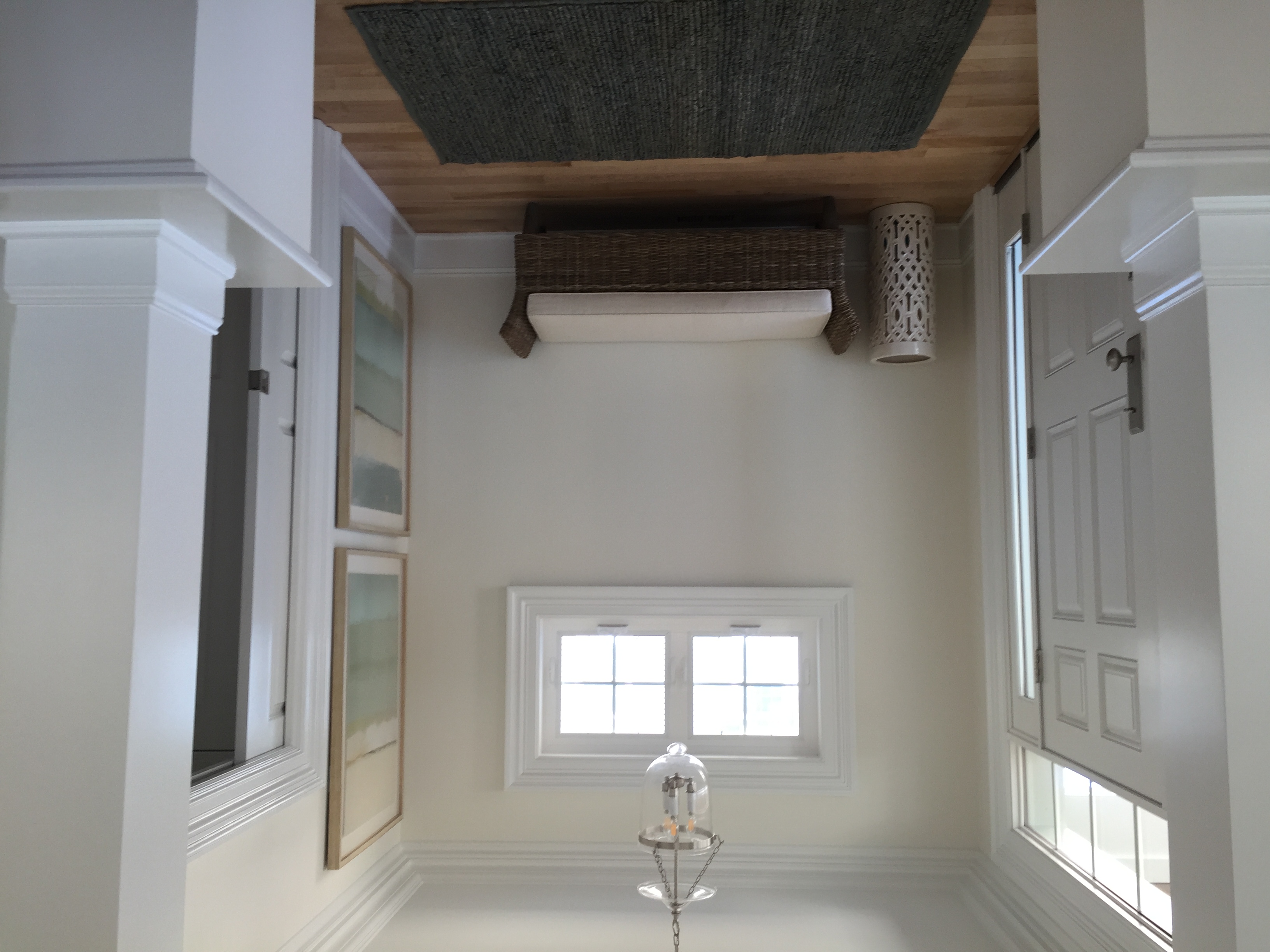
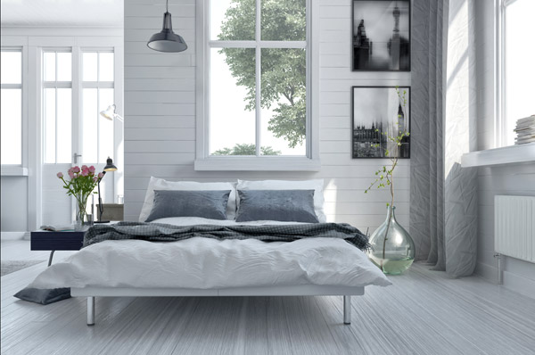
Hey Lisa – I just moved into a new construction home. Our builder painted every wall gray (which I love) but it just isn’t working with my furniture (everything looks dull). Any ideas to liven up the look? FYI – I am on a tight budget. Thanks – Jessie
Gray is everywhere right now so I am not surprised to hear that it is the color used in your new home. There are lots of ways to work with the gray walls without feeling like your home is boring and drab. Here are a few budget friendly suggestions:

tassel-stripe-pillow-cover-pale-harbor-o

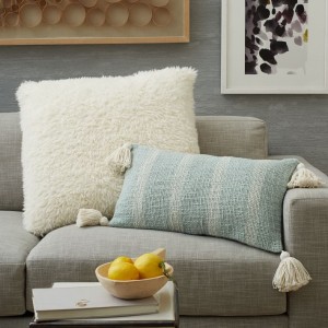
Image West Elm: http://www.westelm.com/products/tassel-stripe-pillow-cover-pale-harbor-t2133/?pkey=cpillows%7Cpillow-covers%7C4294963733&group=1&sku=9056727
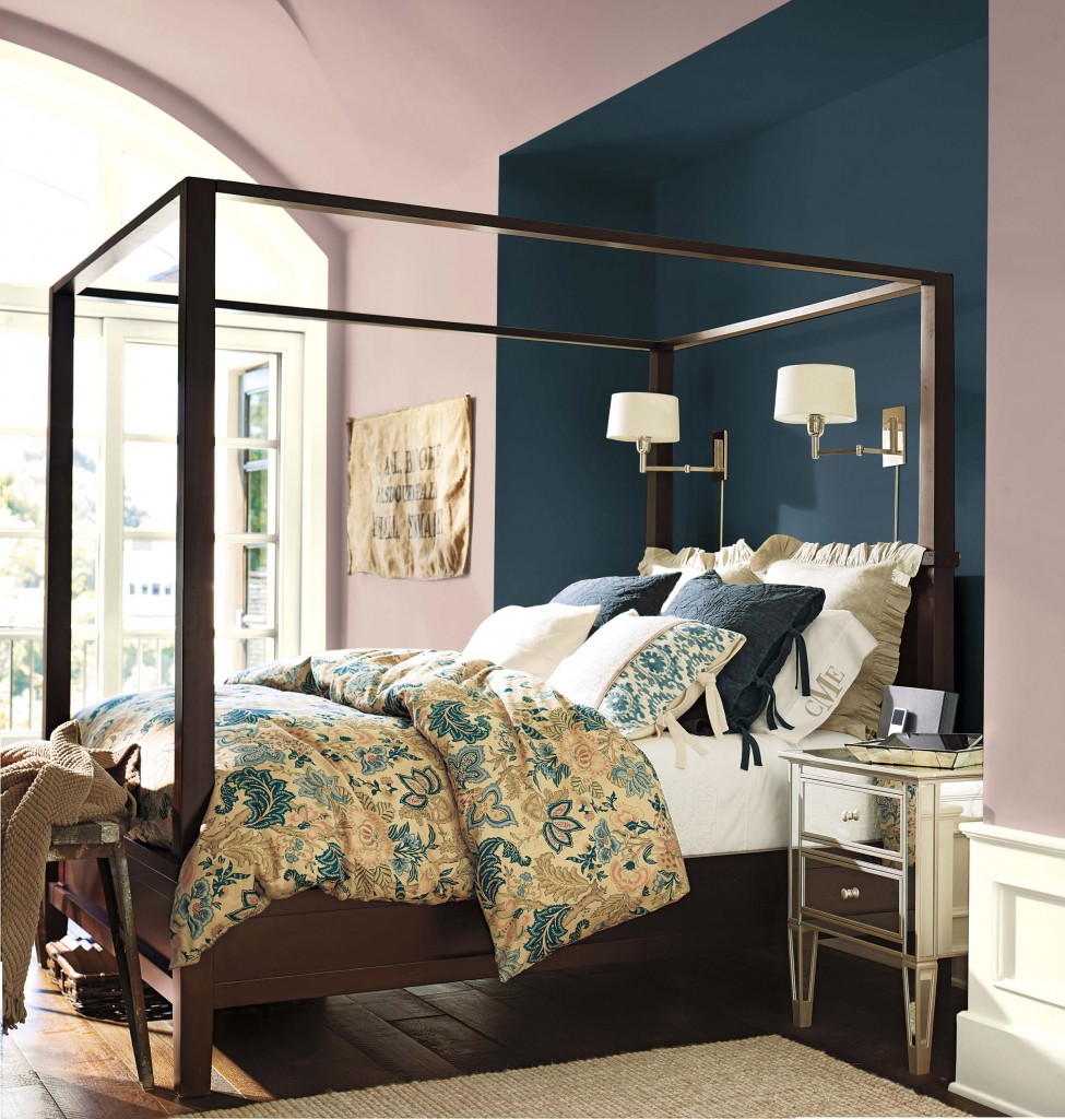
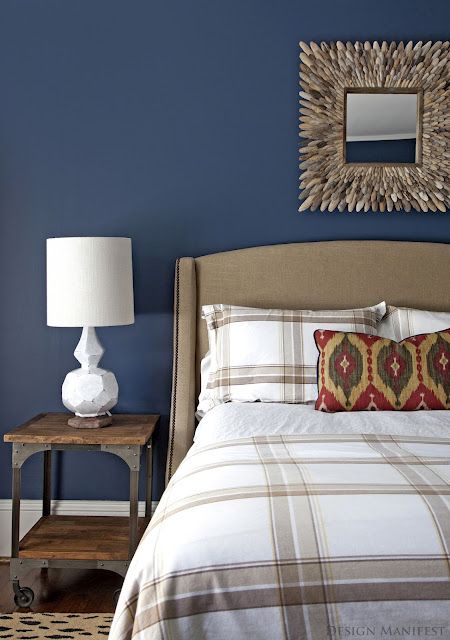
Blend in the Gray

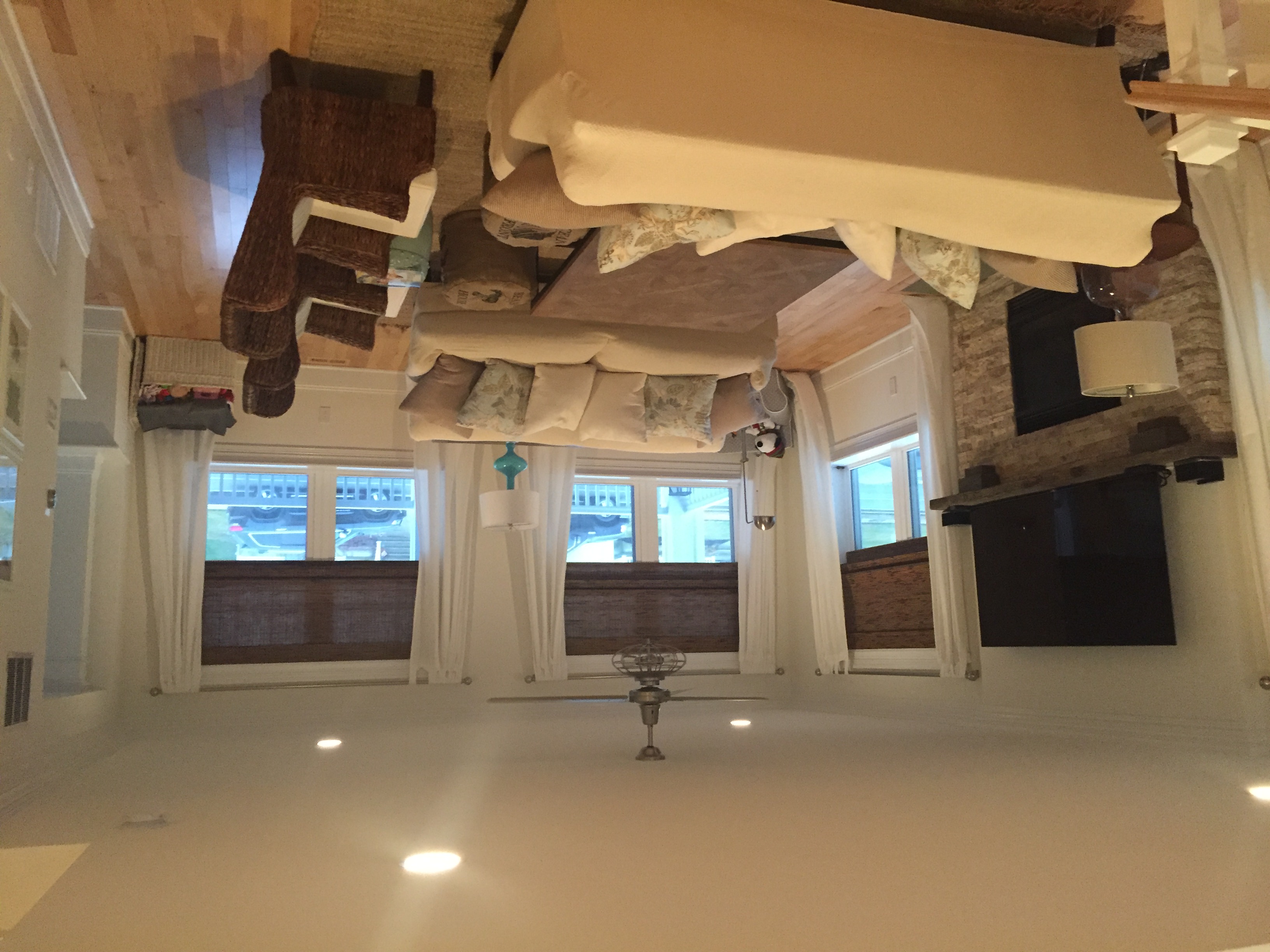
There are many colors that look lovely with gray. For example, you can go for something soft and calm yet still introduce color. Pale blue or aqua blue mixed with white can be incredibly sophisticated on the backdrop of gray walls.

Decide which direction you want to take you color palette. You can then repeat these colors in different saturations, variations and portions throughout your home.

There are creative ways to tie the gray back to your selected colors. Something simple such as throw pillows in a multi-color pattern can marry the gray to other colors in your furnishings. An area rug that blends gray with your other colors can pull together the scheme.
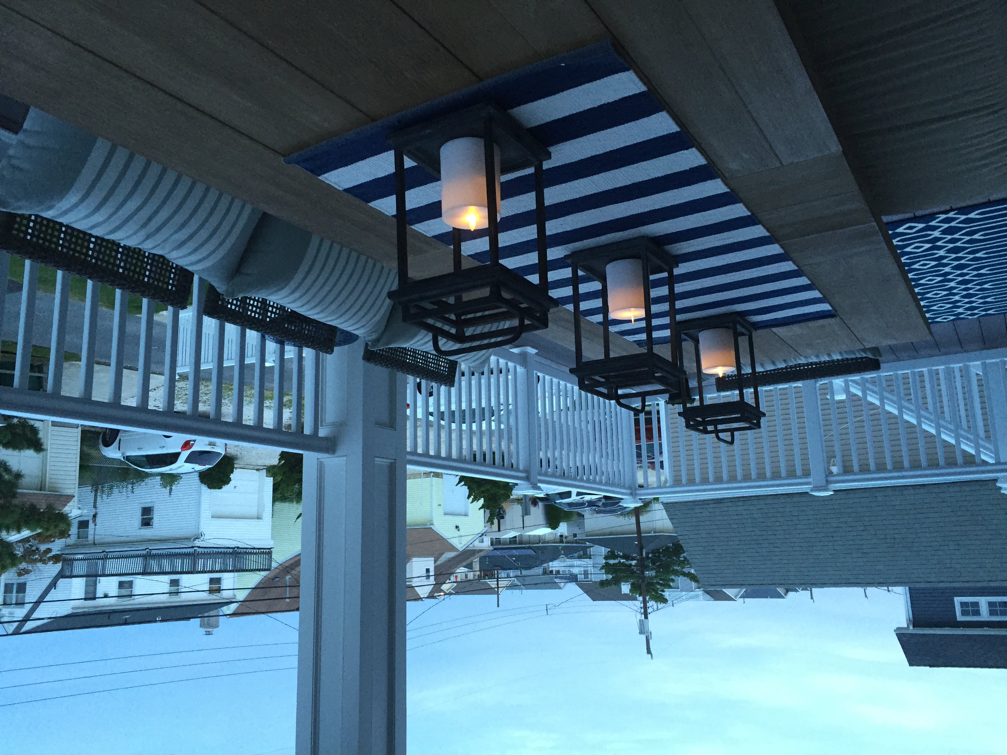
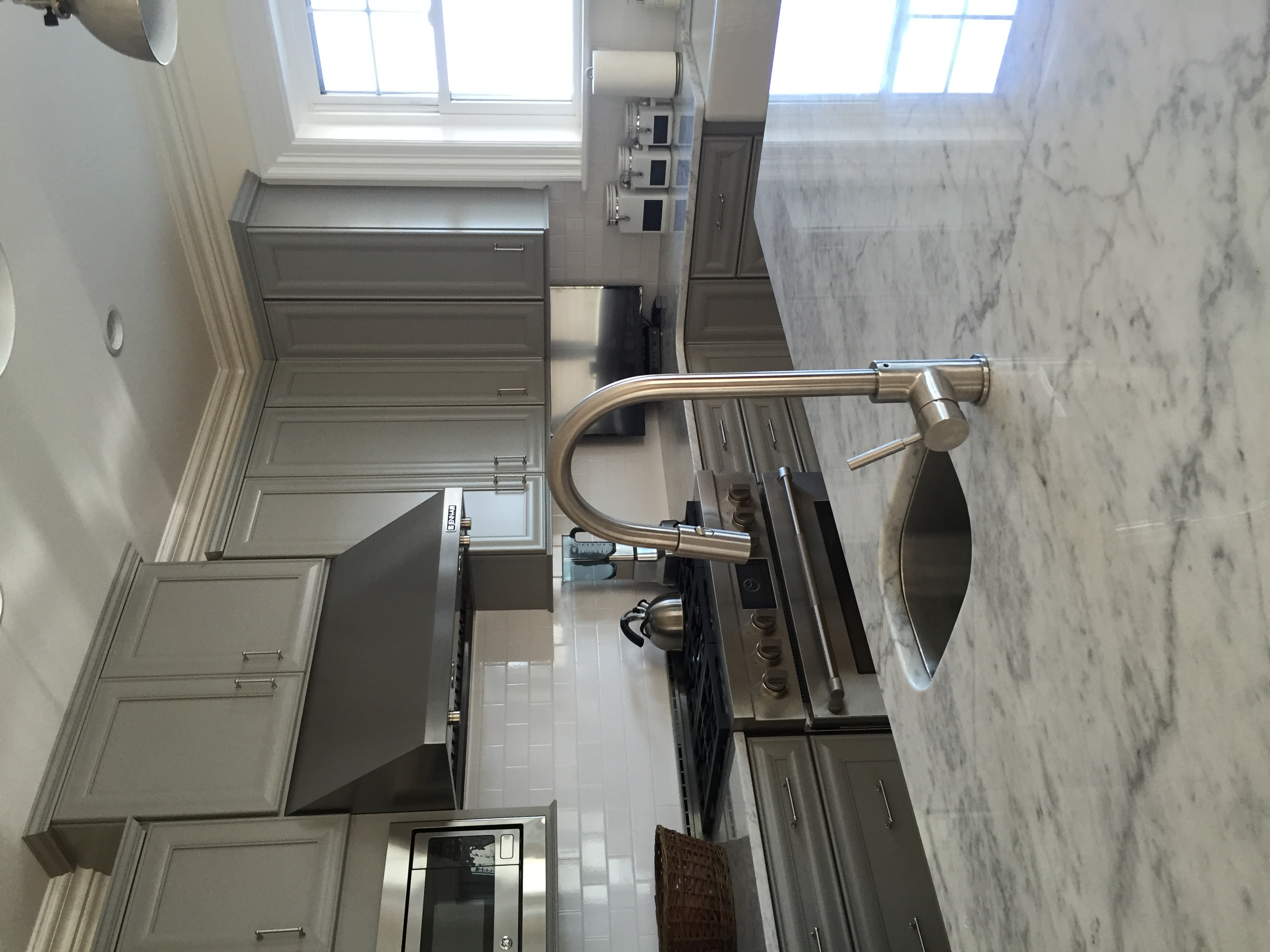
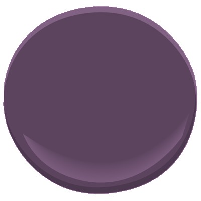
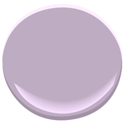
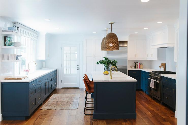
Warm up the Gray

Think outside the box and use a color palette that adds warmth to the gray. I have used gray walls with a camel leather sofa and brass light fixtures. You can’t get much warmer and richer looking!
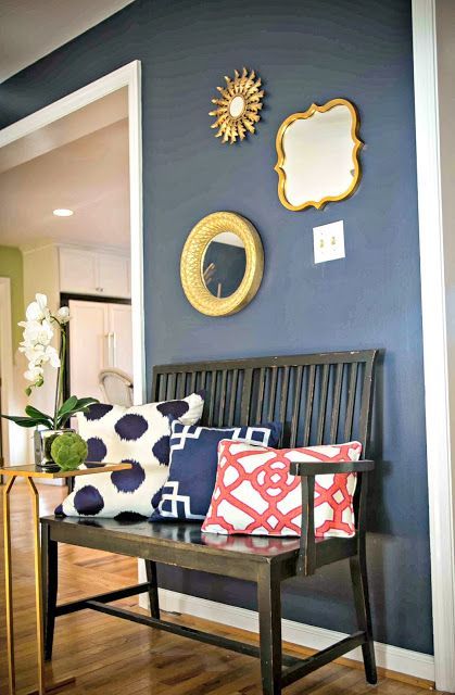
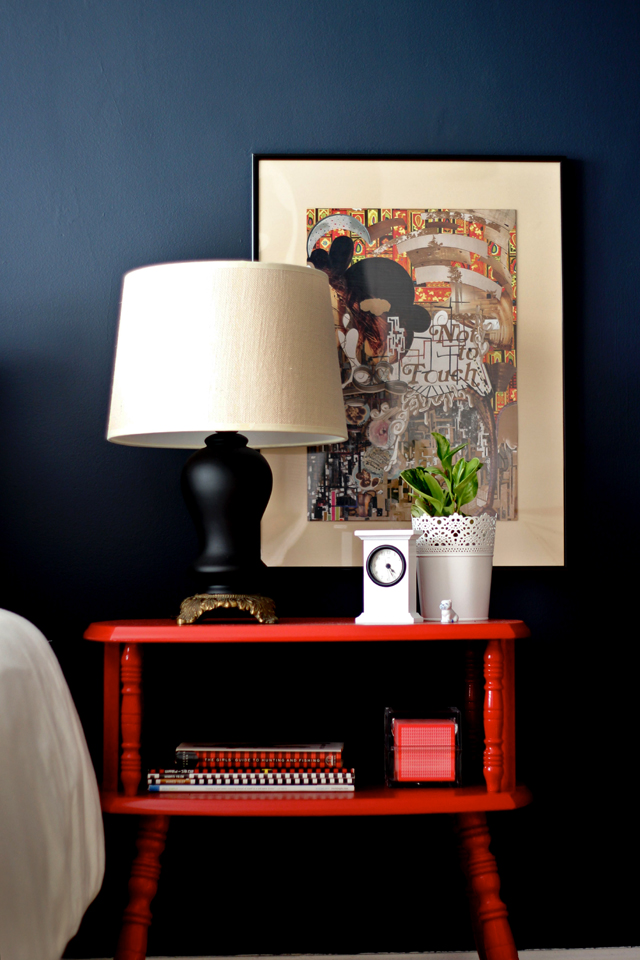
Liven up the Gray

One of my favorite is indigo blue and coral mixed with gray. This creates a bold and vibrant look!

Lighten up the Gray

As the color of shadow, gray can sometimes look dark and drab. Solves this by adding multiple light sources to avoid a shadow look. Overhead fixtures will give lots of clear lighting. Adding lamps to the overhead lighting creates a layered look and lightens the feel.

Enjoy the Trend

Yes, I do believe that gray is a trend and just as it came in it will go out. Therefore, I suggest that you think long term. If you invest in something like a new sofa, consider a light neutral color that works with gray but can also work with another color scheme. This way, when the trend goes, your sofa does not need to go with it.

Please feel free to submit your design questions just like Jessie did! You can read more about my online interior design help and services: Interior Design Service Online.

Love This Lamp

The changing season and warmer weather prompted me to search for some fresh new ideas; so this past week, I spent much of my extra time searching the web for new design sources.

I stumbled into Stray Dog Designs.  The above table lamp is one of their designs, and I adore it!  The best news is that the “Sarah Lamp” as well as countless other furnishings they offer are available in numerous other colors.


This lamp is happy and fun and is just the type of fresh idea I was hoping to find.

My Favorite Way to Organize Shelves – By Color!

I was working on a Living Room design this afternoon and my client had a question about how they should layout the books and other items on a pair of bookcase.  The answer for their room – by color of course!  This might also be the answer for your house too.

And this type of design is so simple to do.  Start by pulling everything off the shelves and set items on the floor in color piles.  Don’t have enough of one color?  Start searching other rooms of your home or your sister’s house perhaps for a few other items.  Once you have your little color collections pulled together, assign a color to each shelf in the order of a rainbow.  Remember ROYGBIV from science class? (Red,Orange, Yellow, Green, Blue, Indigo, Violet).

As a highly visual person, a bookcase with no rhyme or reason to the arrangement of items makes me nuts.  This is a great spot to show a little personality and zest, and the best part is that a cool arraignment cost no more money than simply shoving items on the shelves.